Dashboard
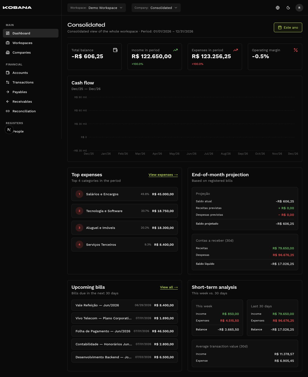
Dashboard (/dashboard) is the home screen of Smart Finance. It consolidates the organization's financial health into two tabs: Performance (what already happened) and Cash flow (the projection of what is coming).
Filters
- Period — date range picker, in the header. Each tab opens on its own default preset.
- Company — comes from the selector at the top, or consolidates every company in the workspace.
- Granularity — Day, Week, Month or Year, at the top of the tab. Each tab has its own.
- Account — on the Cash flow tab only, to project over a specific account.
Performance tab
Looks backwards: the numbers for the period that has already settled.
Metric cards
Four indicators, each with a trend sparkline:
| Metric | Description | % change |
|---|---|---|
| Total balance | Sum of the financial account balances | — |
| Income in period | Inflows realized | Yes |
| Expenses in period | Outflows realized | Yes |
| Operating margin | (income − expenses) / income | — |
Only Income and Expenses compare against the previous period. The percentage badge exists on those two. Total balance and Operating margin show the sparkline but carry no change badge — there is nothing to compare them against honestly.
Realized cash flow
Chart of the balance across the period, with the histogram of settled inflows and outflows underneath and the Day, Week, Month and Year tabs to choose the bucket size. The peak and the lowest balance are marked on the point itself, and hovering shows the biggest entries at that point.
Options that make no sense for the period are disabled. A granularity that would render a single bar is not offered: on "This month", Month drops out (it would collapse into one block) and the view opens on Week. On "Today", only Day is left. Same rule as the Cash flow tab.
Top expenses
The top 4 expense categories in the period, with a shortcut to the expense listing.
Short-term analysis
Compares This week against the Last 30 days, and shows the average value per transaction over the 30-day window.
This panel ignores the period picker. Its windows are fixed — this week and the last 30 rolling days — and do not change when you switch the period in the header. It is the most common source of confusion on this screen: its numbers do not "match" the cards on purpose, because they measure something else.
Cash flow tab
Looks forward. The old /cash-flow route redirects here (/dashboard?tab=cash-flow).
Besides granularity, this tab has the Account picker, to project over a specific account.
The four cards
| Card | What it shows |
|---|---|
| Current balance | Today's balance, with the account count |
| Projected inflows | What is due to be received in the window |
| Projected outflows | What is due to be paid in the window |
| Projected balance | The balance at the end of the period, with the lowest projected balance from here on and the change vs. today |
In a window with no future, the titles change. Looking only at the past, the last three become "Realized inflows", "Realized outflows" and "End balance" — they stop promising a projection when there is nothing to project.
The low point is a warning about what lies ahead: it only scans future periods, because a dip that already passed warns you of nothing. And it only appears when it falls below the end-of-period balance — if the worst moment is the last one, repeating the number would say nothing.
"Projected balance" is not "end-of-month balance". It is the closing balance of the last period in the range you picked. Over a 90-day range, it is the balance at the end of those 90 days — not of the current month.
What goes into the projection
Three sources, summed:
- Pending bills — payables and receivables, by due date. Payables only enter once approved, when approval is on (the default).
- Forecast transactions — those marked as provisional, by date.
- Virtual occurrences of recurrences — this is the subtle one. A recurrence is recorded only up to the provisioning horizon (12 months by default; see Installments and recurrence). In a projection reaching past it, the system continues the series on read, generating the occurrences that do not exist as records yet. They are not stored — they exist only in the projection.
What is past due does not vanish: it is pushed to today. A bill that came due last week and is still pending neither stays in the past nor disappears — it lands in today's group, because it is still money that will go out or come in. The breakdown flags it: "Includes R$ 1,200.00 in past-due bills".
Overdue and Upcoming
Two panels, not one: "Overdue" and "Upcoming (30 days)". Each separates what is payable from what is receivable, and says how many days ago it came due or how many days until it does.
Chart, breakdown and scenarios
- Chart of the balance per period: the line is the balance (solid where settled, dashed from Today on), with the peak and the lowest balance marked on the point and the zero line highlighted; underneath, the histogram of Income and Expenses for the same period. Hovering shows income, expenses, balance and the biggest entries at that point. Above it sit the Summary and By category tabs, which drive the chart and the table at the same time — they do not belong to the table, even though that is where the difference shows most. Under By category the chart swaps the balance curve for one line per category, with income above zero and expenses below: both sides show at once, and the zero line is the water line. The legend underneath separates each side's categories.
- "Breakdown by period" — table with Opening balance, Inflows, Outflows, Period net and Closing balance. Those five rows are the Summary tab: under By category the balance rows drop out, leaving only Inflows and Outflows broken down by category — it is a flow reading, not a balance one. Clicking a period opens the entries that make it up, flagging what is Realized, Projected, Past due and what came from a recurring series.
- Scenario — what-if simulation: Defer or Remove bills from the projection to see the effect on the Projected balance and the Worst projected balance, without changing anything for real. Clear undoes it.